Apple Music, on a real phone
Design lead for Apple Music, 2015 Launched, 2015

Design lead for Apple Music, 2015 Launched, 2015
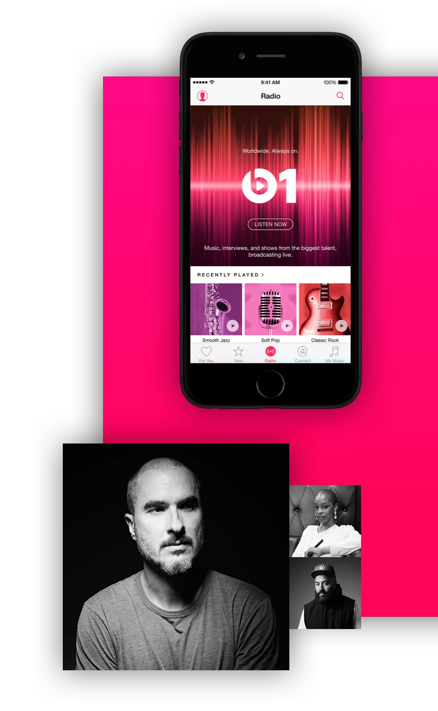
Before Apple Music shipped, nobody could react to it. So the art direction went onto a working prototype, and the genre photography got argued in the room rather than on a board.
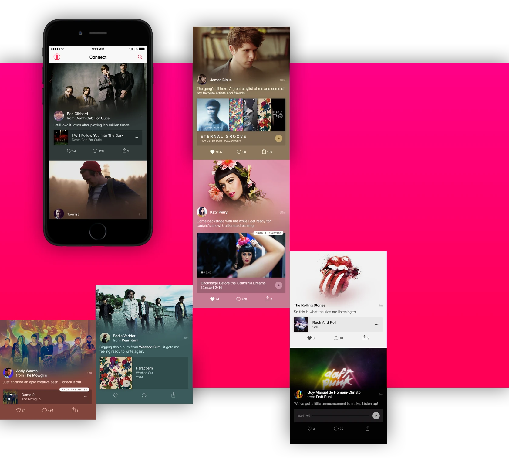
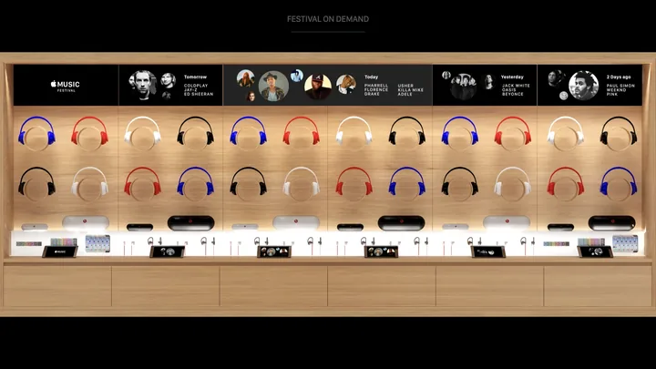
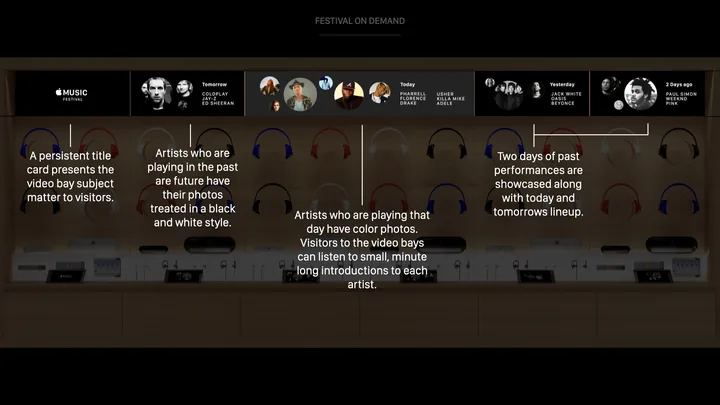
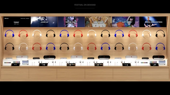
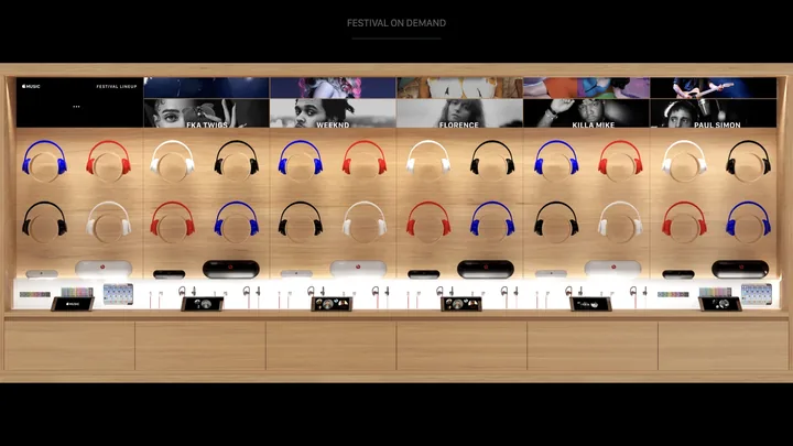
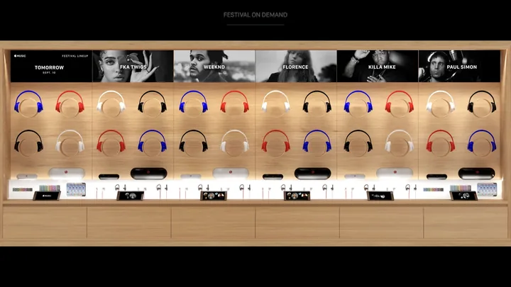
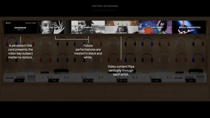
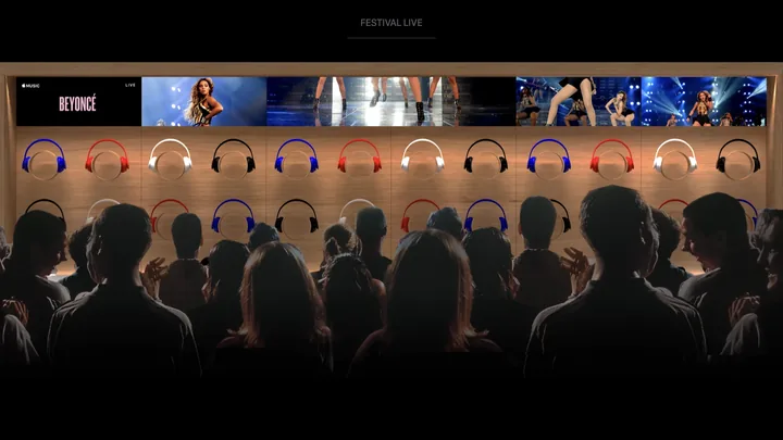
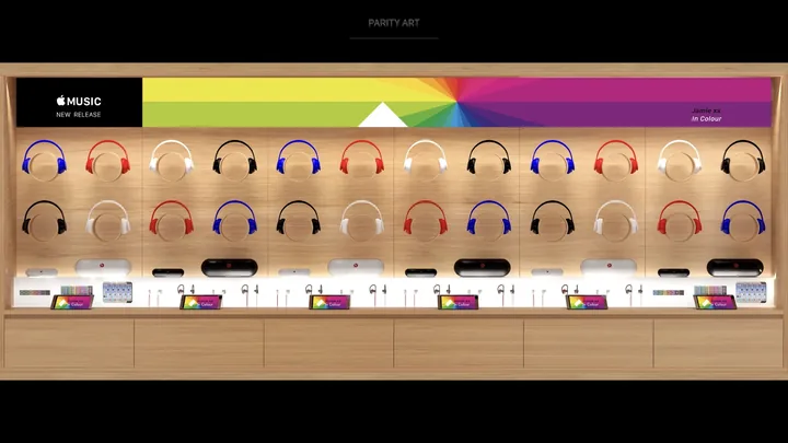
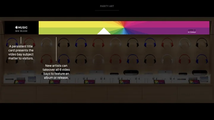
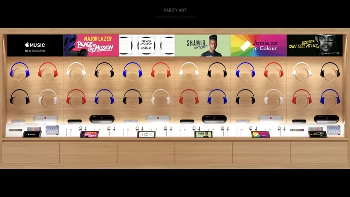
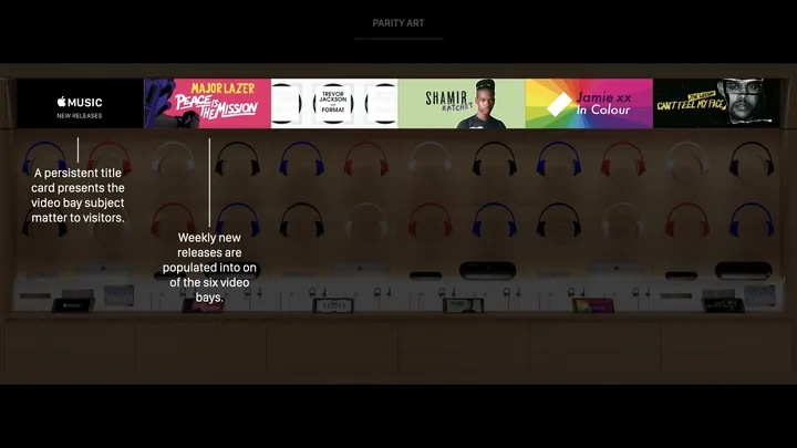
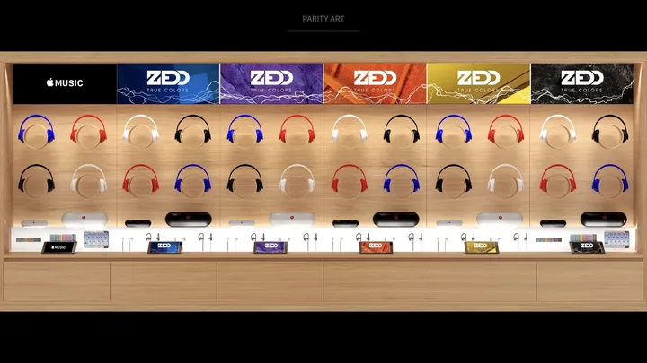
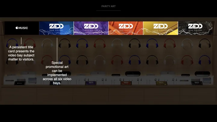
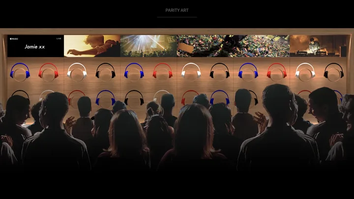
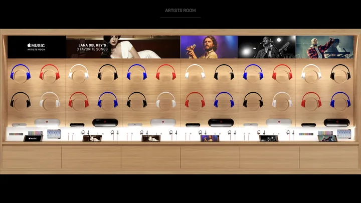
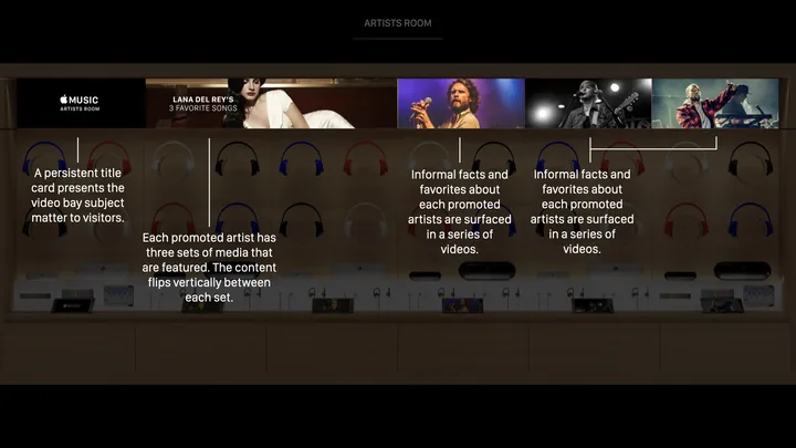
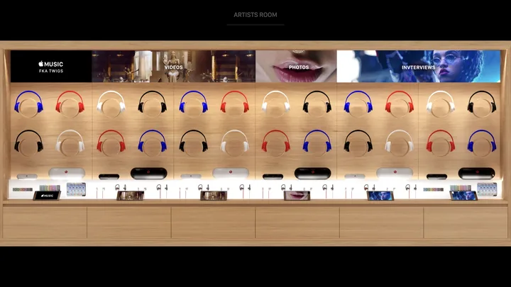
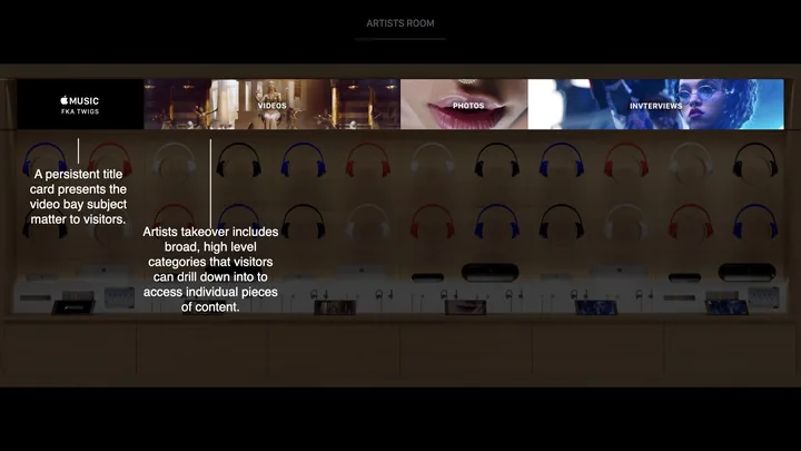
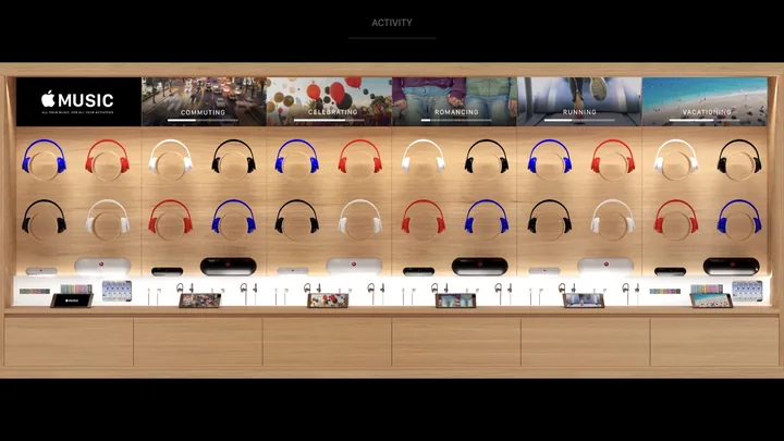
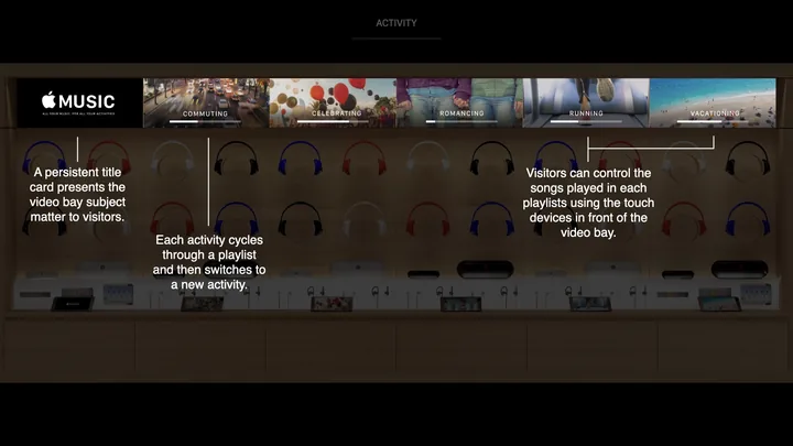
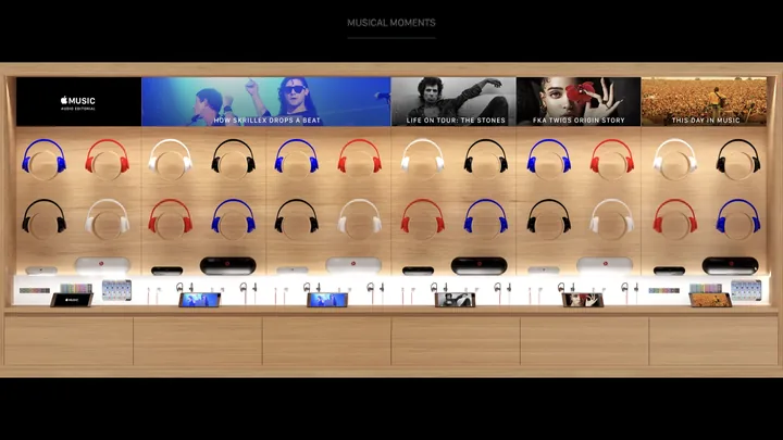
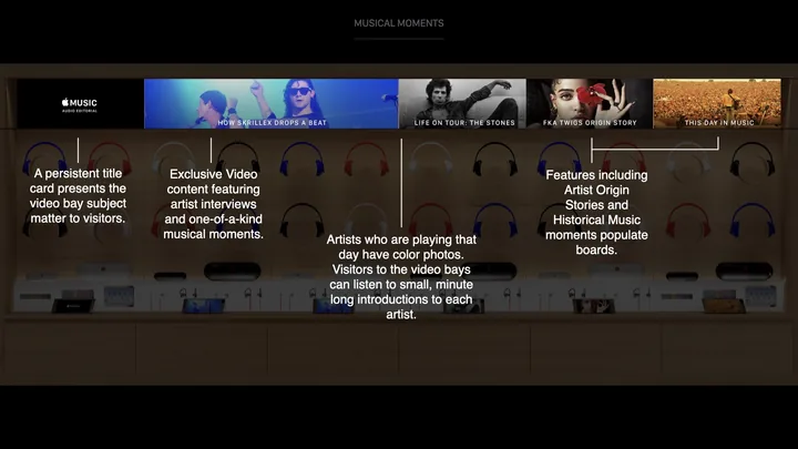
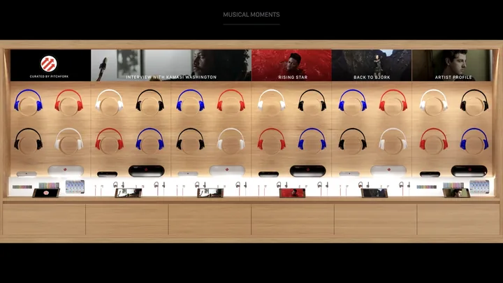
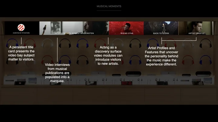
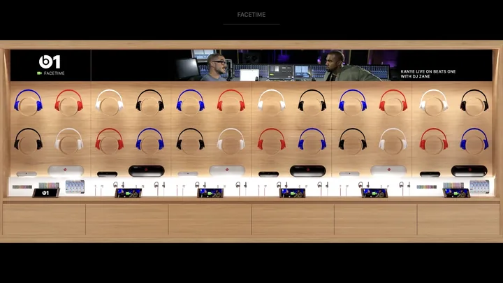
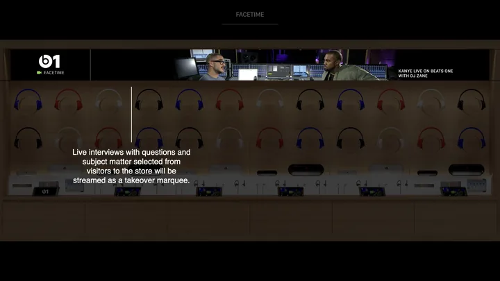
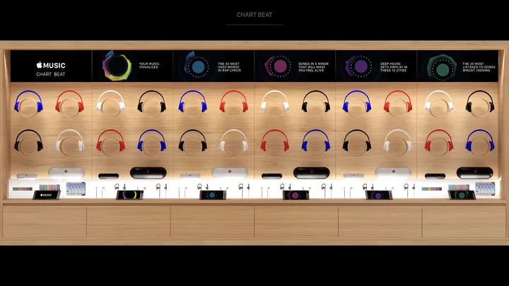
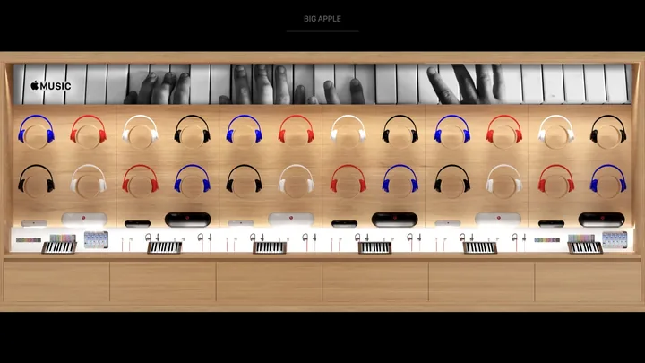
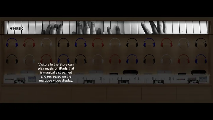
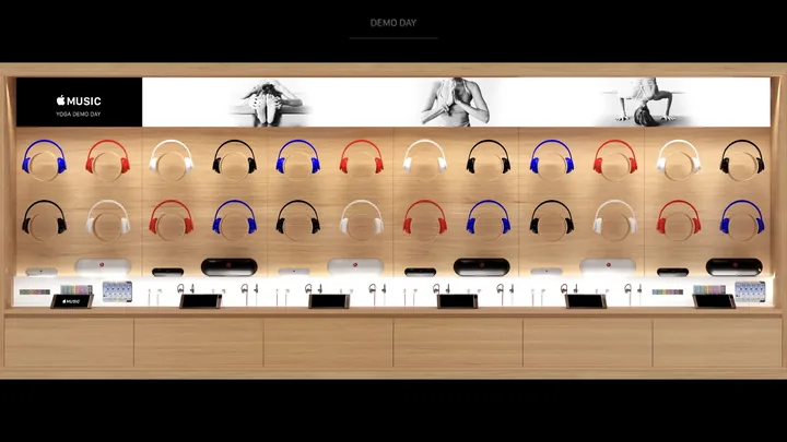
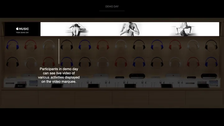
A working prototype of the app for in-situ reviews, the motion studies for how it looks moving, the in-store experiences, and Artist Connect, which tints the interface to each album's palette against 50,000 covers.
Through Portal in 2015, reporting to the ECD of the iTunes division: a skunkworks designer on the prototyping projects, and the iTunes brand design partner on the website.
Product in Hand
Genre photography at phone size. The jazz page looks like the room it was recorded in, moody and underlit. Play a record and Artist Connect reads the sleeve and tints the whole interface to match.
Product in Life
A jazz page on a working phone in someone’s hand, not a board on a wall. The room could hold it, scroll it and say no to it in the same meeting, which is how the photography got decided.
Product in Culture
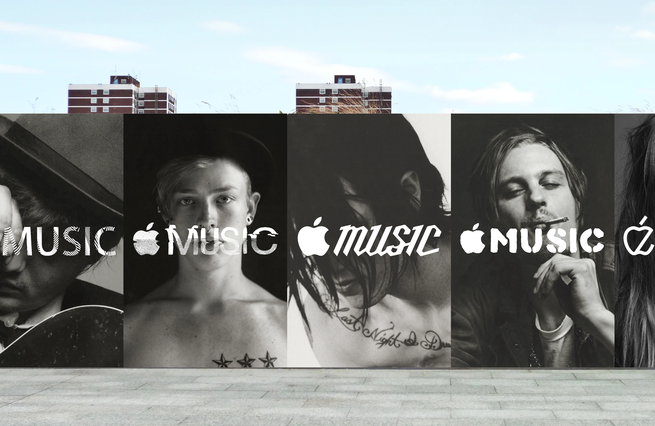
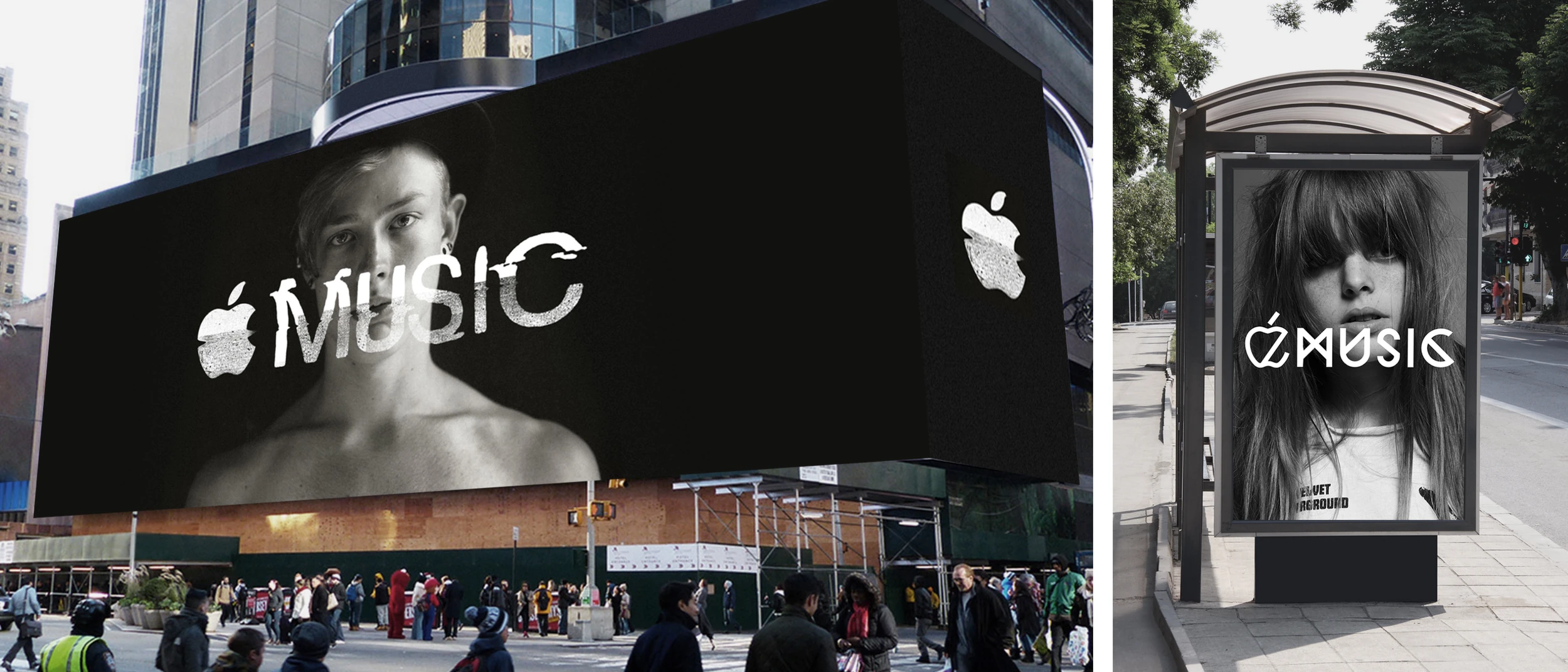
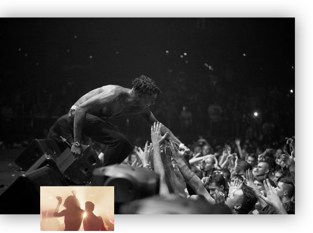
Album art was the size of the record. On a phone it is a thumbnail, so the interface carries the mood. Streaming put every record in reach, and the more there is, the more the picture has to do.
Position:
Product and experience design lead, through Portal
Services:
Strategy, Design
Partner:
Apple
Status:
Launched, 2015