Chris Znerold Product + Brand Systems · AI Design Engineering

Investments that Pay

Creative director for ShareClub, 2022 Launched, 2022
Public companies spend to win customers and mostly ignore the ones who already own shares.

Strategy:

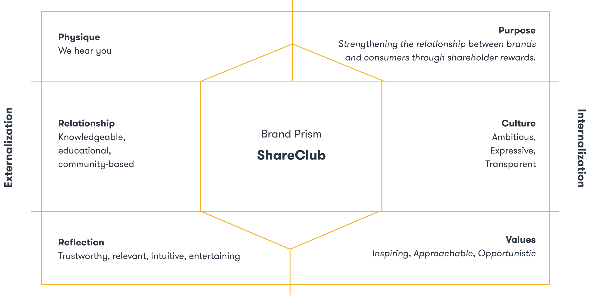
Financial products read as arcane to a Gen-Z market. So the brand makes holding a share feel like being in a club, youthful and playful where fintech is gray.

Design:

The name came out of a sprint. From one brand prism: the winking eye mark, sticker badges in mustard and coral, the app, out of home and the social feed.

Leadership:

I was head of brand and product at Stay Gold, working directly with ShareClub across the identity and the product. It went to market, and the playful position separated it from the rest of fintech.

Product in Hand

A share that winks.

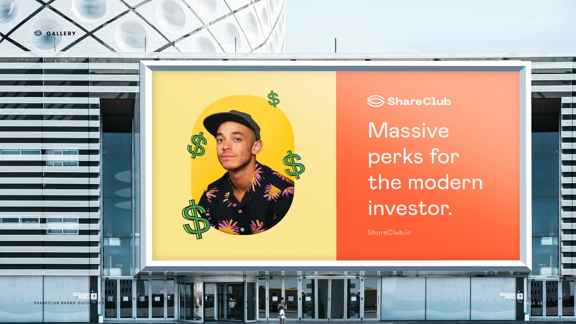
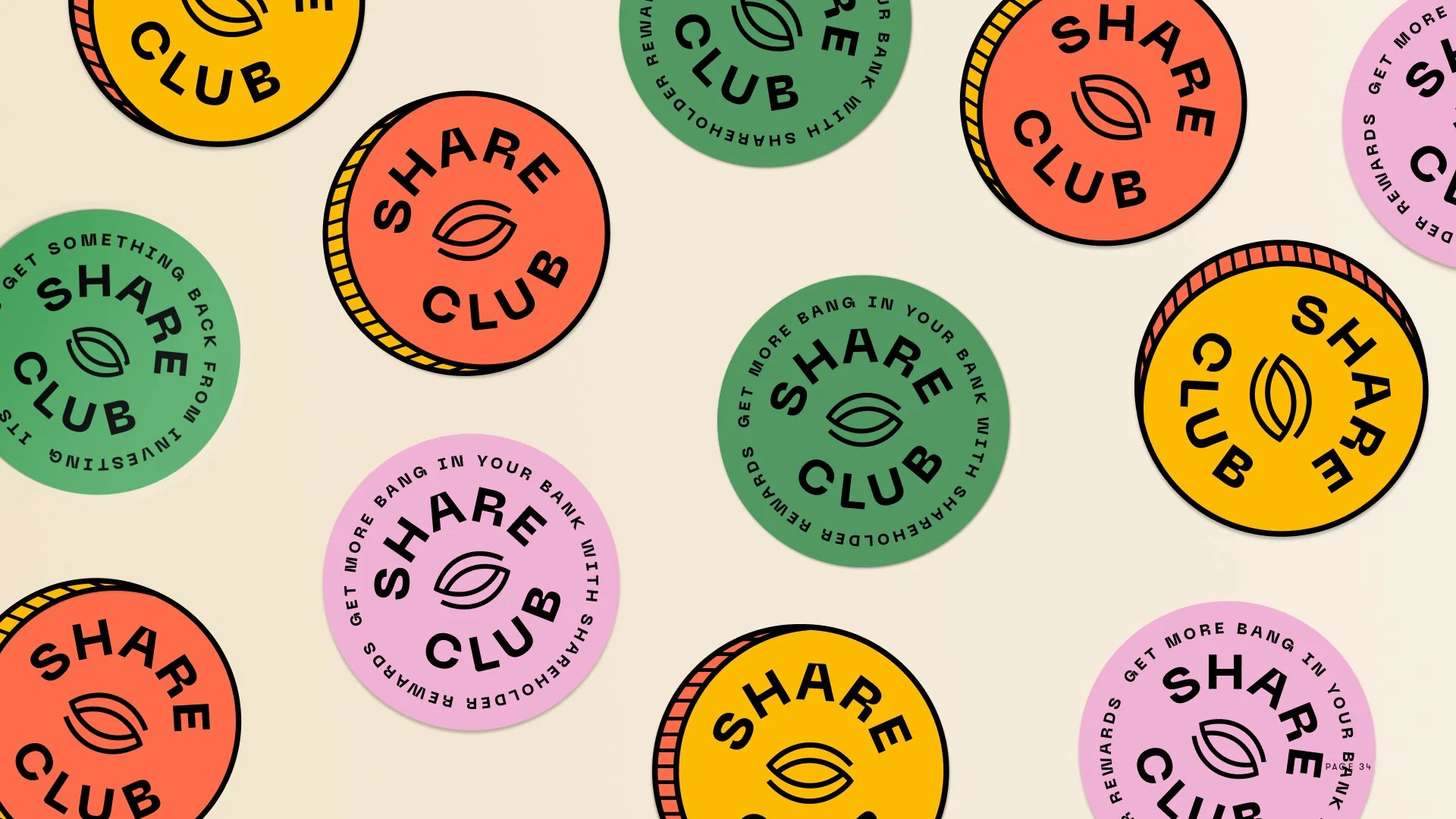
A winking eye for a mark, and a club badge in mustard and coral that repeats like a sticker sheet. Three phones on pink: experience shareholdership with perks. A billboard: massive perks for the modern investor.
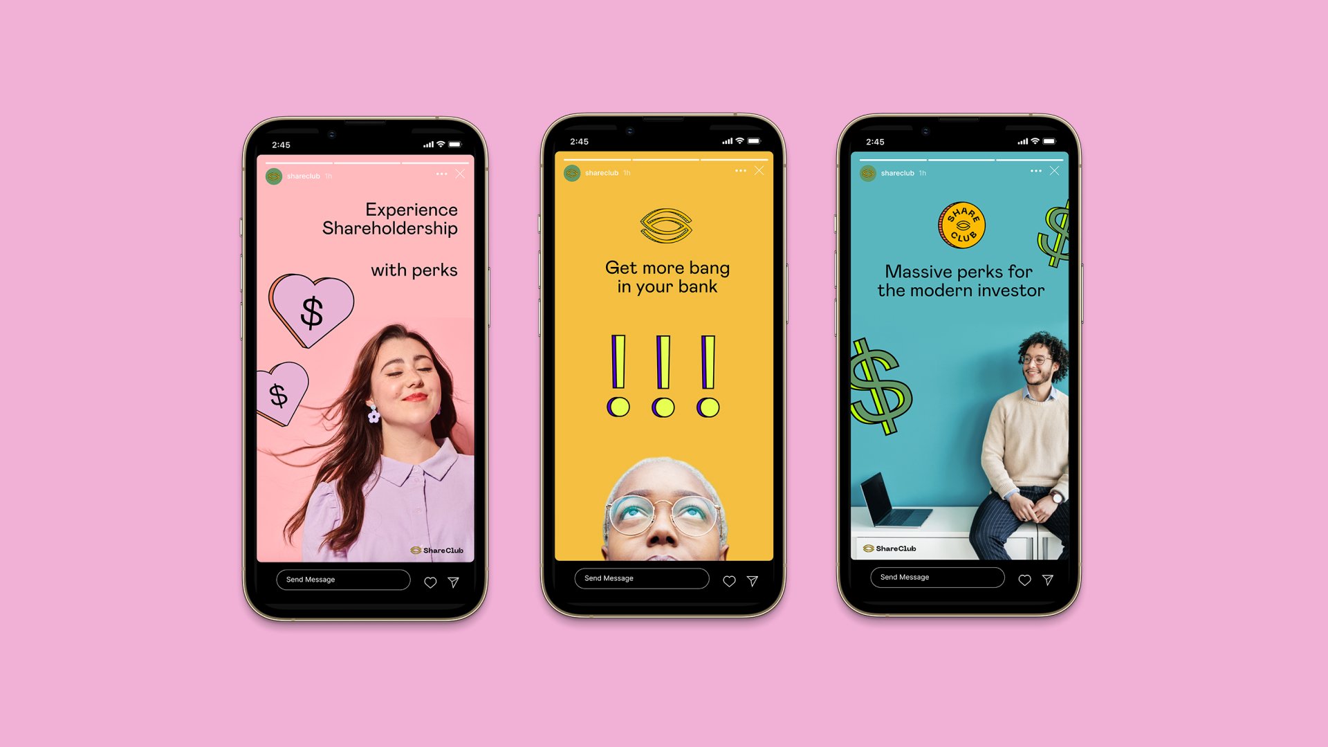
Three phones on pink: experience shareholdership with perks, get more bang in your bank, massive perks for the modern investor

Identity with intention

Making investing simple, engaging, and rewarding.

Product in Life

Paid for what you hold.

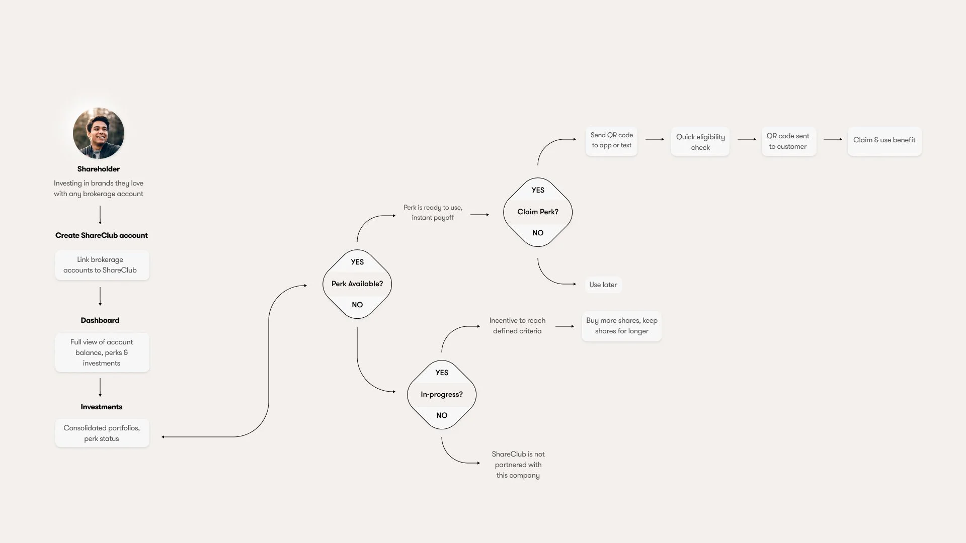
You already own a piece of the brand you buy from most. ShareClub pays you for buying from the companies you hold shares in, so the receipt and the share certificate finally point at the same person.
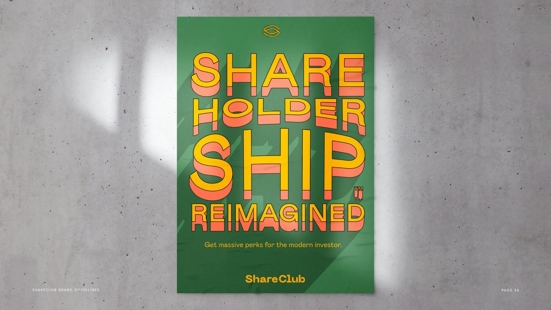
The ShareClub profile on a phone: Shareholdership Reimagined
Brand book01/16
The brand guidelines cover: the winking-eye mark in mustard over Brand Guidelines, on black, ShareClub v1.0, April 2022
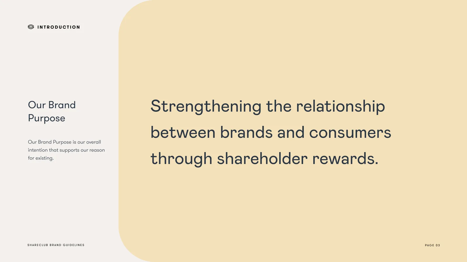
Our Brand Purpose: strengthening the relationship between brands and consumers through shareholder rewards
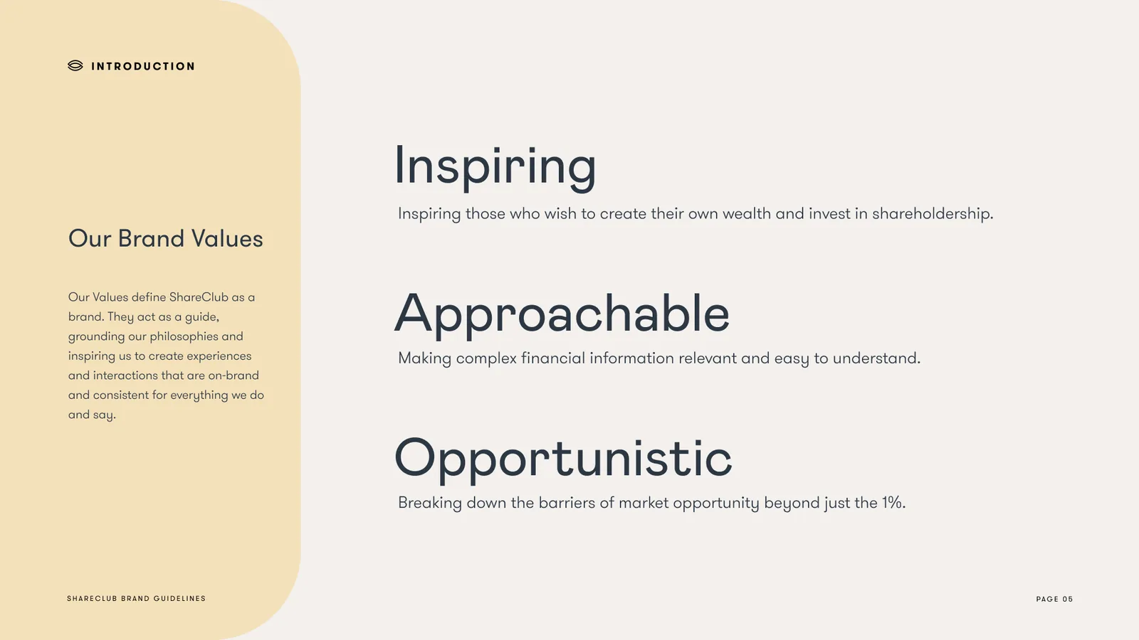
Our Brand Values: Inspiring, Approachable, Opportunistic
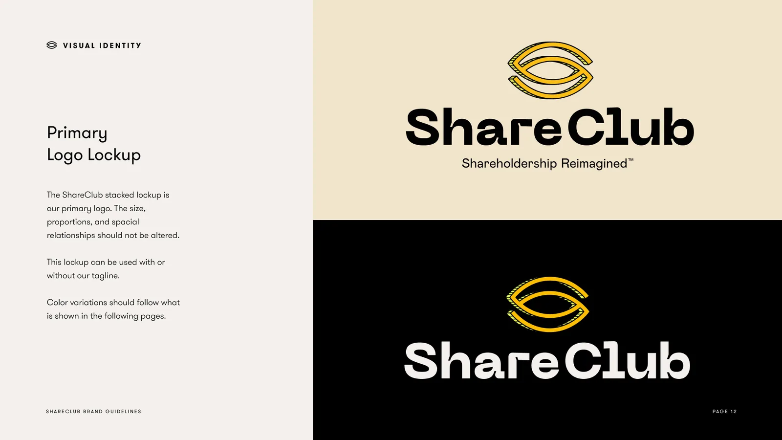
Primary logo lockup: the eye mark stacked over ShareClub, Shareholdership Reimagined, on cream and on black
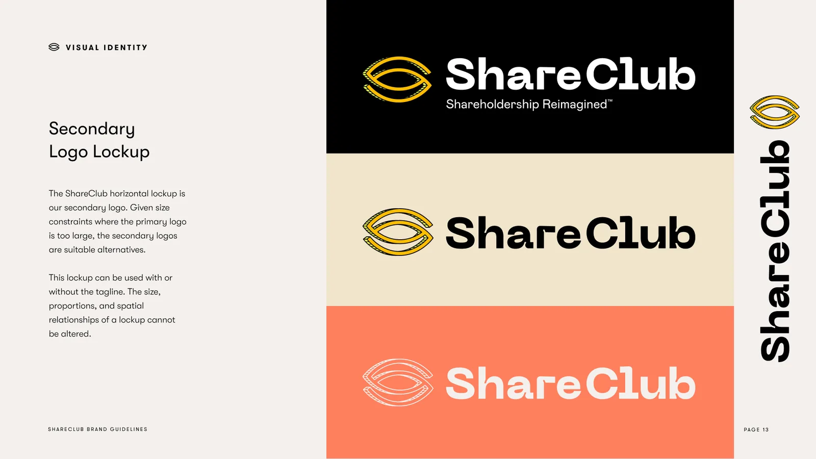
Secondary logo lockup: the eye mark beside ShareClub, on black, on cream and on coral
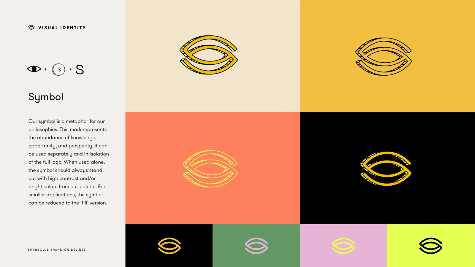
Symbol: the winking eye across the palette, mustard, coral, black, evergreen, pink and chartreuse
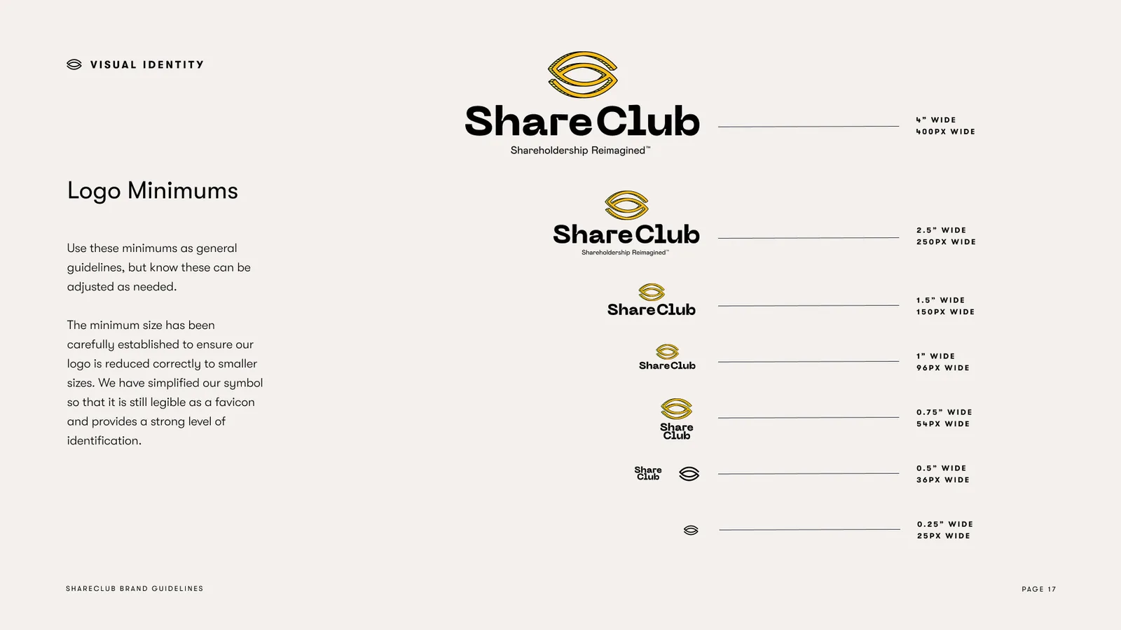
Logo minimums: the stacked lockup and the mark from four inches down to a quarter inch
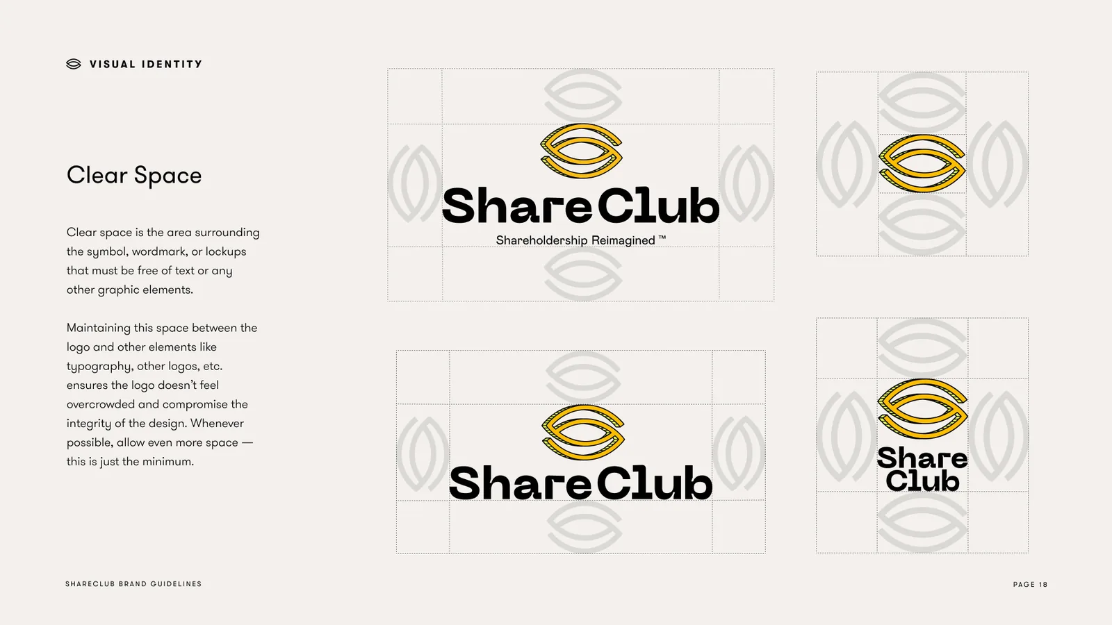
Clear space: the eye mark as the unit around the wordmark and the stacked lockup
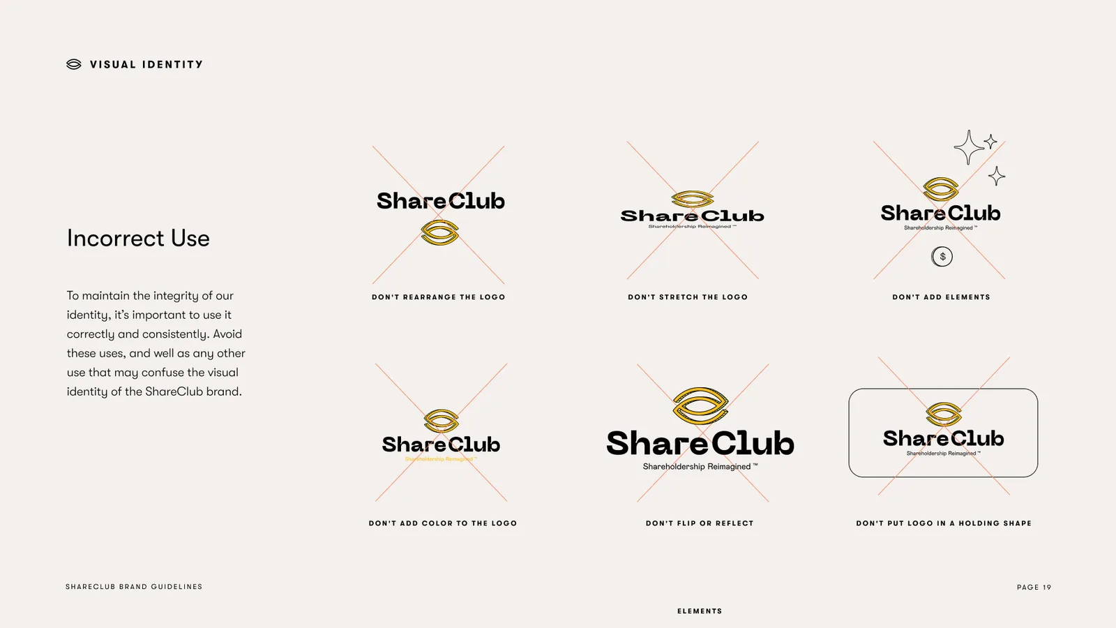
Incorrect use: six things not to do with the ShareClub logo
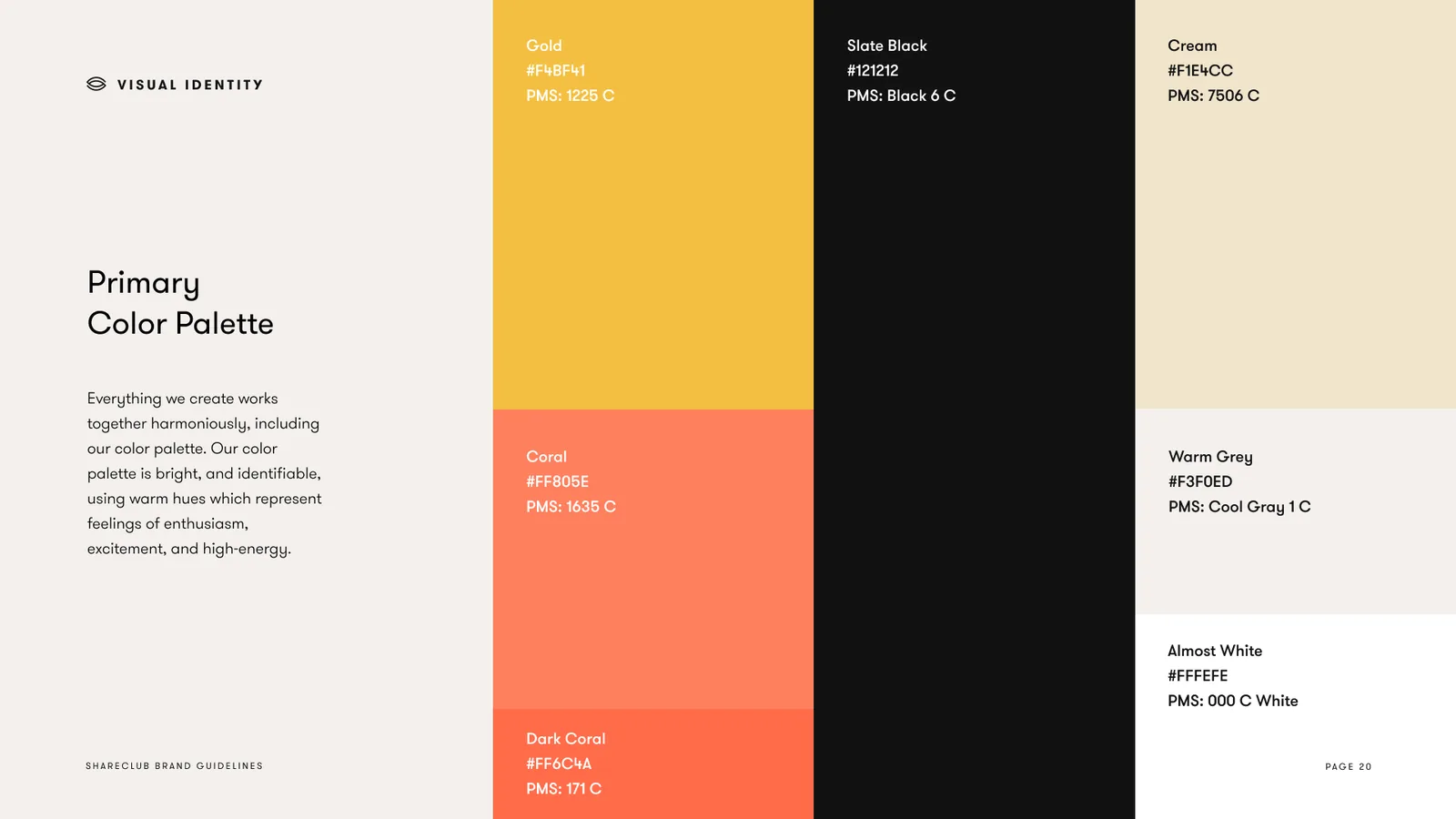
Primary color palette: Gold, Coral, Dark Coral, Slate Black, Cream, Warm Grey and Almost White
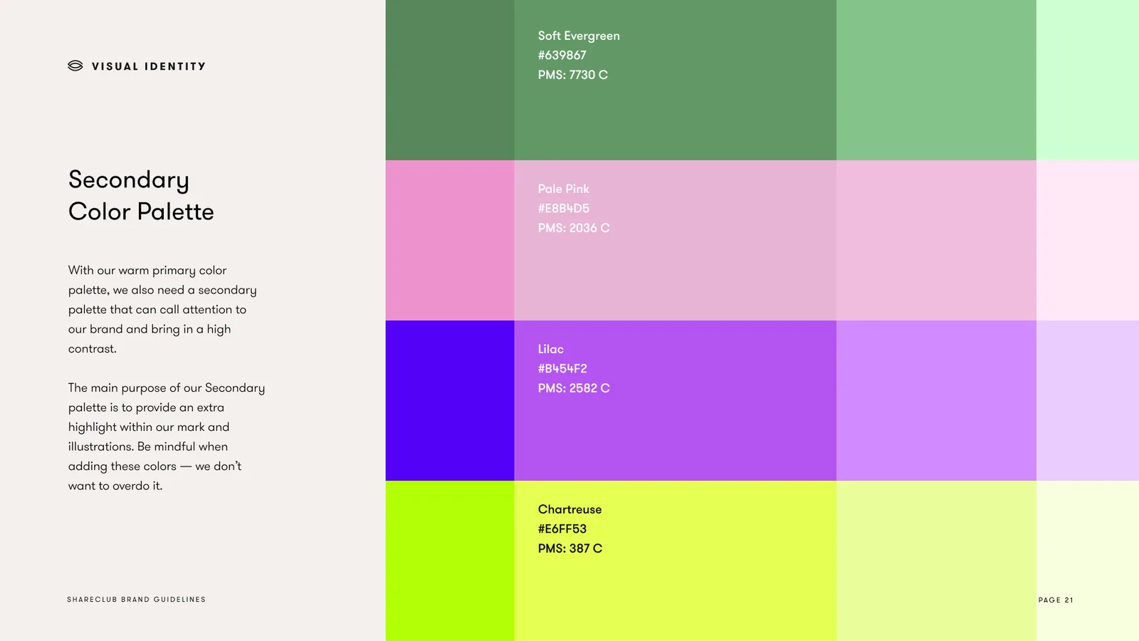
Secondary color palette: Soft Evergreen, Pale Pink, Lilac and Chartreuse with their tints
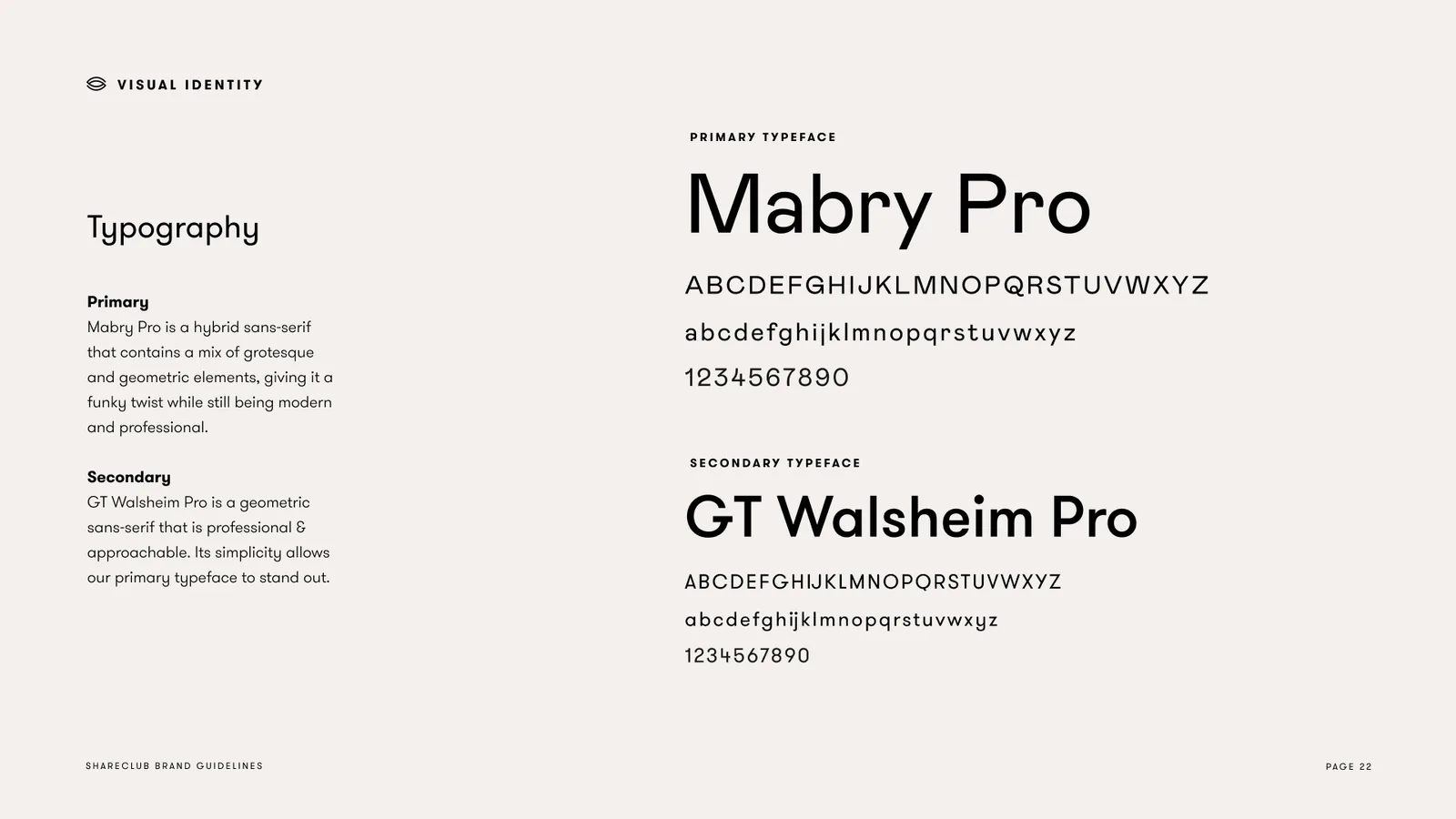
Typography: Mabry Pro as the primary typeface, GT Walsheim Pro as the secondary
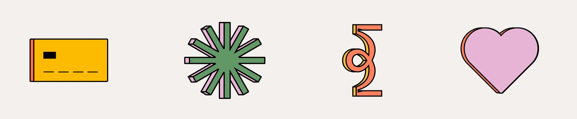
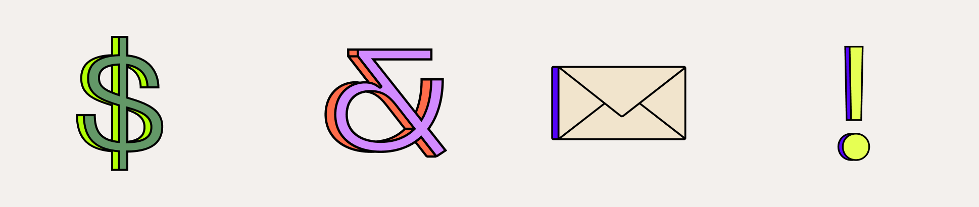
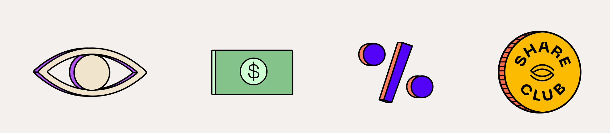
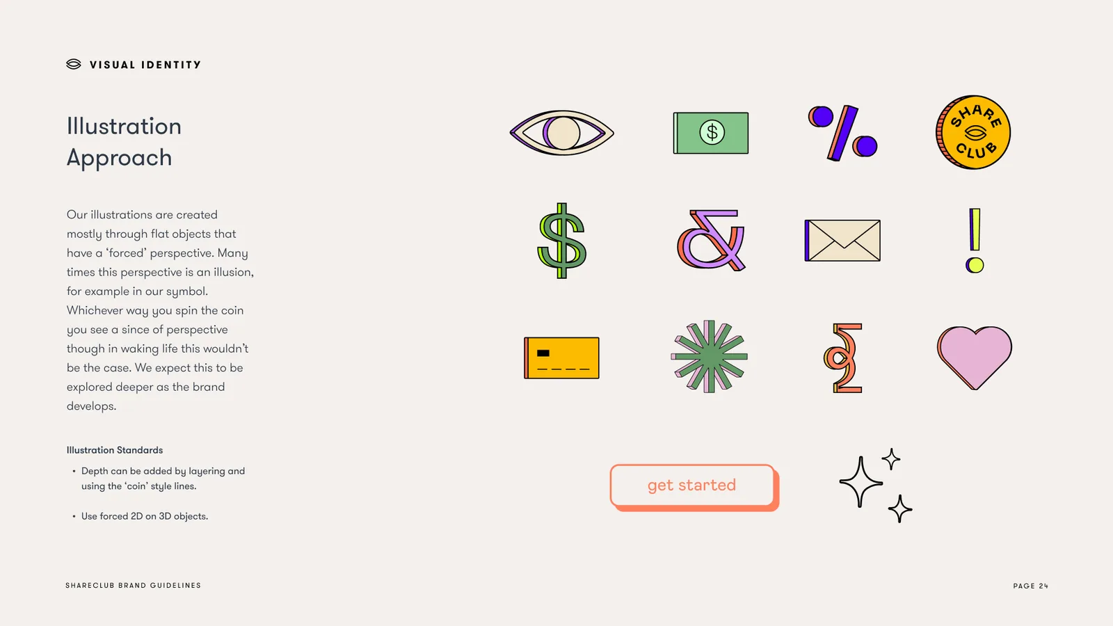
Illustration approach: the eye, a banknote, a percent sign, the club badge, a dollar sign, an ampersand, an envelope, an exclamation point, a card, a burst and a heart
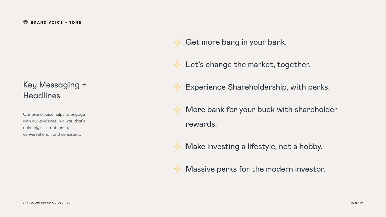
Key messaging and headlines: Get more bang in your bank, Let's change the market together, Experience Shareholdership with perks, Massive perks for the modern investor
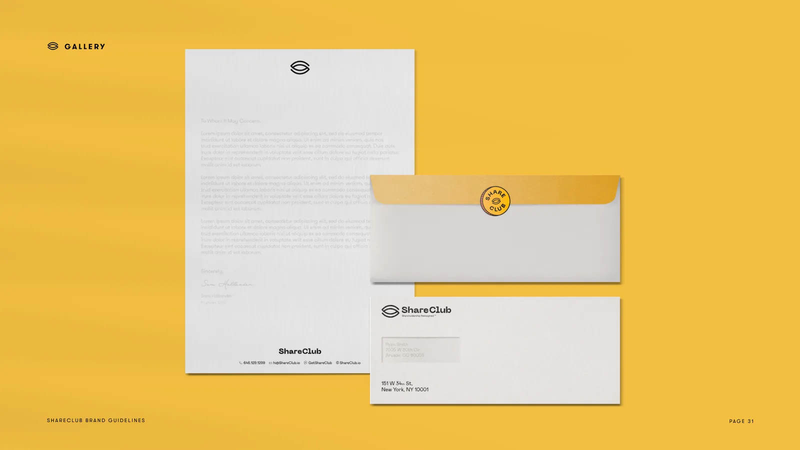
Stationery on mustard: letterhead, an envelope and a compliments card carrying the eye mark
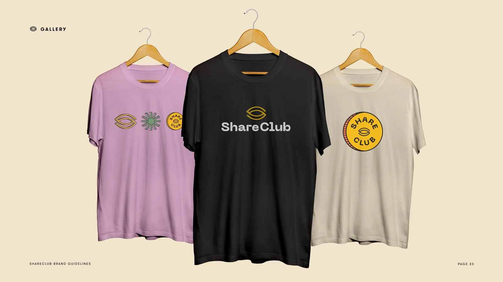
Three tees on hangers: lilac with the eye mark, black with the ShareClub wordmark, cream with the club badge

Product in Culture

Owners and customers never meet.

Trading apps turned a generation into shareholders without turning them into customers. A public company knows its buyers by the receipt and its owners by the proxy statement, and the two lists never meet.

A laughing woman in sequins, lit pink and blue

Position:

Head of Brand & Product at Stay Gold

Services:

Research, Strategy, Design

Partner:

ShareClub

Status:

Launched, 2022